The first time I powered on the Nintendo Switch, I was struck by the seamless experience it offered. The clean user interface and minimalist design aesthetic contribute to a user experience that is both simple and intuitive, facilitating fast navigation. While playing video games on the console is undeniably enjoyable, I couldn’t help but feel a desire for additional features due to its minimalistic design approach. Recognising several areas where improvements could enhance user satisfaction, this study aims to delve into one primary user flow: the process of finding digital games on the Nintendo Switch. Currently, users are limited to browsing through different tabs in the eShop to discover new games.
Currently, the only way to find games is by browsing from the different tabs in the eShop.
- Discover
- Recent Releases
- Current Offers
- Charts
- Coming Soon

My Hunch
With the ever-expanding games library available on the Nintendo Switch, users don’t always know what to play. I believe there is more Nintendo could do to help its users find games they would enjoy.
Currently, the main way to discover new games is through the lists I mentioned above. However, these lists aren’t great recommendations; they are simply various collections of games sorted into categories. To enhance these recommendations, personalisation is key. For instance, an 8-year-old who enjoys child-friendly games like Minecraft might see the same list as a 28-year-old who prefers the dark fantasy action RPG, Dark Souls. Clearly, their tastes may differ significantly.
Before embarking on this study, I sought to understand others’ experiences with the Switch. It didn’t take long before I encountered individuals expressing similar sentiments. That confirmation was all I needed to proceed along this path.

Research – Online Survey
I created a survey to learn about the end-users and their experiences with the Switch. I went for a more broad approach to get some general information and to see what users liked and didn’t like about the Switch. In writing the survey, I was careful to ask questions without leading the interviewees and seeing whether or not they were in line with the hunch I had. This was a good way to check if I was on the right track.

Key insights from the interviews:
- Users rated the overall eShop experience 72/100. Not a bad score but not great.
- The majority purchased their last game from the eShop
- They didn’t read the ‘news’ section of the Switch
- “I would like game ratings from players” (Could be used to help recommend games)
- Users would find what to play from other sources. ie. Friends/family or social media
- Users did browse the eShop

After reading the responses to the survey and searching online for other users pain points I sorted via an affinity map (see above). One interesting discovery is that most users were finding games via other sources, so it might not matter that users weren’t using the Switch to find new games to play. Although this did help support my hunch. Perhaps users would find more games on their Switch if it was easier.
Also, many other issues could be looked at to improve the user experience. Below is an Effort vs Impact chart displaying issues concerning the amount of effort it would take to implement fixes.

Effort vs Impact
- Longer battery life
- Recommendations page/tab
- User reviews
- Bluetooth headphone connection (recently added)
- 4k upgrade
- Game folders (Organisation)
- Voice chat on system
- Improve social experience with friends online
- English option for other regions
- Remove games on wishlist once purchased
- Better menu music
User Persona
Next, I created a User Persona to help me during the process of this UX study. Based on the surveys I did and user data Nintendo released¹. I put together this profile for John Tisdale. A tool to help myself think from a typical users perspective.

Research – Phone Surveys
To have a more in-depth conversation I decided to conduct a few phone call interviews. With a focus on how they discovered games to play on their Switch. This was more qualitative research than the online surveys but was very useful. Most users weren’t purchasing games based on discovering them on the Switch console itself.
I even had a subject request for a feature that would “suggest games like Netflix suggests shows”. Users wanted to find games on their console, confirming my hunch again. Another recurring idea was adding users reviews to games. Very common with online shopping. So the next step was to find the best way to implement this.
Ideation
Doing research and gathering data is a large part of UX design. As I try to collate this data and find connections I am trying to see what direction it is leading me down. I now have a good idea of the problem, but shouldn’t be too quick to make the solution. The ideation stage of the process helps produce ideas for solutions before any work is done on development. Making it easier to be creative and brainstorm ideas without getting attached to them.
Crazy 8
To help with thinking of new ideas and outside the box, I did a quick activity called Crazy 8. Give your self a short amount of time to create eight ideas and they don’t have to be practical in anyway. It helps loosen up and maybe think of directions that you may not of considered. After this I evaluated each idea.
Storyboarding
After exploring various solutions, I started to narrow down with one. Creating a storyboard of the process. This helped identify potential issues and also lets others get a more tangible idea of what my plan is.


Market Research
As I started to head towards a solution for adding in a recommendation feature to the Switch. I looked into how others implemented this kind of feature. No need to reinvent the wheel, lucky for me this idea is not new and plenty of others are doing it.
According to the Nielsen Norman group²:
“Recommendation engines are now common on a variety of websites and apps, often using some kind of artificial intelligence (AI) to drive personalized choices.”
“Personalized content was so highly valued over generic content..”
“Users appreciate personalized content suggestions and are willing to give up some of their privacy for quality recommendations, while accepting some inaccurate recommendations.”
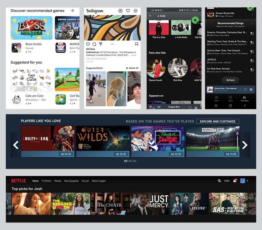
Discover recommended games – Android Play Store
Suggested Reels – Instagram
Fans also like – Spotify
Recommended Songs – Spotify
Players like you love – Steam games app
Top picks for user – Netflix
Some of the examples I found were:
Google Play store – They had multiple sections where it displayed suggested apps
Instagram – Suggested reels, users
Spotify – Recommending artists and songs you may like
Steam – Suggestions based on games played before and similar users
Netflix – Suggests shows you may like based on what you and others have seen previously
Concept Design
Where?
Brainstormed ideas on paper of where I could put this suggestion feature.
• In the main menu
• In the eShop
• As a pop-up on main screen
• Have a character show up in the menu that speaks to you
• Create a mailbox – get messages with recommendations

I chose 3 possible options and created quick mock-ups of what it could look like and did a little survey on which version people would prefer.
Personally, I thought A would be the best option however C won. Perhaps I needed to do a bigger survey group to confirm findings. However, I had moved forward with C.


Prototyping
Paper Prototype
Before going onto the computer, I used paper prototypes to quickly test potential designs. It is a great way to find out if users would understand my solutions and see where potential problems were.

Findings
• Paper prototype doesn’t replicate the experience 1 to 1. As the navigation on the Switch is done with controllers.
• “It was good. It makes sense.”(Navigation)
• Could show more recommendations
• The recommend page would benefit from more revisions.
Lo-Fi Prototype
Based on my initial paper prototype I took my findings and created a digital prototype in Adobe XD. You can see it below.

Findings
• Recommendation button is easy to find
• Scrolling images makes the games scroll too. Should scroll independently
• Similar to the game purchase page
• Positive experience, easy to use
• The number of games on the page could be increased
Mid-Fi Prototype
Iterating on the Lo-Fi prototype, I created a Mid-Fi prototype. The difference between the Lo-Fi and Mid-FI prototypes is that the Mid-Fi goes into more detail. Can include colour, fonts, shapes, icons.. etc that will likely resemble the end product. As the product already exists, I had a solid base to work from.
Conclusion
Findings
Overall positive feedback – worked well
Most users said they wouldn’t change the design
• Buttons didn’t always work on the first click
• One user had a blank screen when going to the review page.
• If you select a game with a review from the recommended page it doesn’t show on the purchase page.
• Review/rate section needs work
More questions arose from this, such as:
– Will reviews just be from your friends or strangers as well?
– How many reviews will be displayed?
– Can you view more?
– How will this be regulated?– Are text reviews needed? Or would 5-star ranking system suffice?
As it is usually the case doing more testing you find areas of your product that could be improved and new potential issues. But with that being said, I have decided to finish the project here. I could iterate a few more times and refine it more however I am happy with the current result and what learnt along the process.
If you have any feedback, please get in touch I would be glad to hear it.
Thanks for reading.